
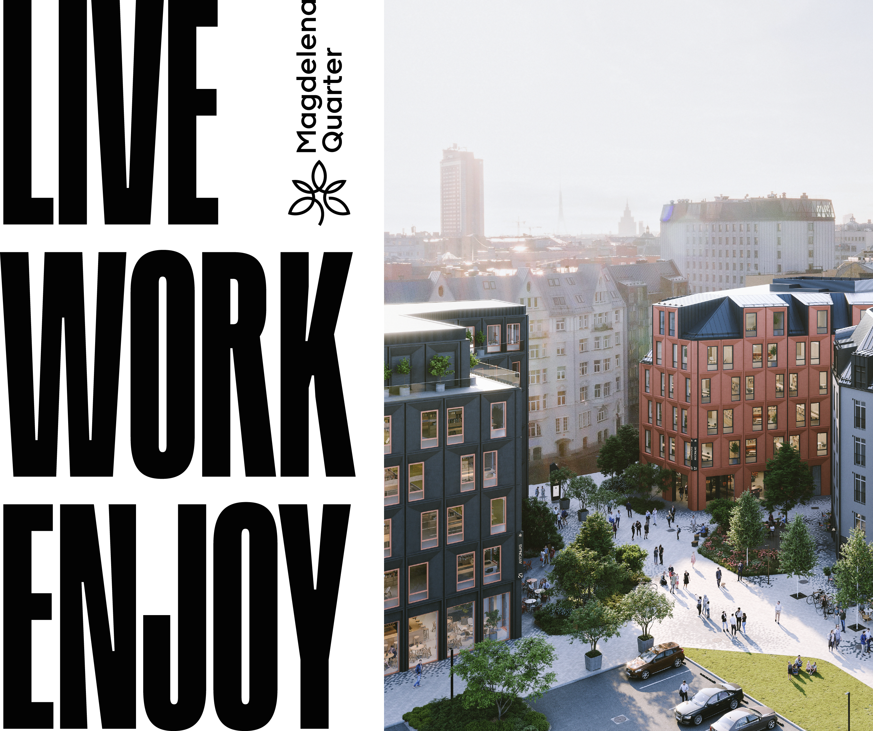
MAGDELENA QUARTER
logo
Magdelena kvartāls brand logo consists of symbol and text. All graphical proportions - optical kerning, refined weight and defined clear space must be used as showed in this document. The rules provide the posibility to use symbol and text part separately. Separately used text part is called Wordmark.
Constant and unchanged use of the logo and its elements helps to make our brand instantly recognizable at all sizes and in all contexts.
Logo variations
Different platforms and mediums have varying size and layout requirements. The logo may require adaptation for vertical or horizontal spaces. Employing multiple compositions provides the flexibility to seamlessly integrate the logo into various layouts, ensuring its visual appeal and legibility are maintained.
Construction
Our logo is based on simple shapes. It is carefully constructed to maintain ownable characteristics while allowing for perfect legibility at any size on any application.


Clearspace
To ensure the logo achieves its optimal presentation, it requires ample space to stand out. Our logo's clear space is defined as equal to the width of the first two letters "Ma" in the logo. It is crucial to ensure that no other element, whether text or image, encroaches upon this designated clear space.
Smallest size
For clarity across digital and print applications our logo should never be reproduced at any size below the adjacent guidance. When a smaller size is required, it is recommended to use only the symbol.
symbol
In situations with limited space, like small icons, favicons, or social media posts, utilizing only the logo symbol enhances visibility and recognition. The logo symbol, with its simplified visual impact, becomes a potent standalone representation of the brand.
Brand Symbol
Different platforms and mediums have varying size and layout requirements. The logo may require adaptation for vertical or horizontal spaces. Employing multiple compositions provides the flexibility to seamlessly integrate the logo into various layouts, ensuring its visual appeal and legibility are maintained.

Clearspace
Clearspace around the symbol is equal to the inside area of the largest leaf height.

Smallest size
For clarity across digital and print applications our logo symbol should never be reproduced at any size below the adjacent guidance.

wordmark
Logo wordmark can be used distanced from the logo symbol.
By placing the symbol at a distance, a visual hierarchy is established, emphasizing its significance in specific contexts. This spatial separation not only allows for enhanced design flexibility but also enables different arrangements to accommodate diverse layouts and compositions.
Wordmark variations
For clarity across digital and print applications our logo symbol should never be reproduced at any size below the adjacent guidance.


Clearspace
Clearspace around the wordmark is equal to the width of the first letter M.
Smallest size
For clarity across digital and print applications our logo should never be reproduced at any size below the adjacent guidance.

wrong usage
Here are outlined common mistakes in logo usage that should be avoided.

colors
Our primary brand color is black, which should be used in conjunction with our broader brand color palette. This palette encompasses both vibrant and calm colors working harmoniously to represent a blend of tranquility and vibrancy within our brand.
Color palette

CMYK 55 / 35 / 15 / 15
Pantone 2136 C
Pantone 2136 U
RGB 115 / 135 / 170
HEX #7387AA

CMYK 0 / 66 / 80 / 0
Pantone 164 C
Pantone 2018 U
RGB 225 / 110 / 50
HEX #FF6E32

CMYK 0 / 25 / 30 / 15
Pantone 7590 C
Pantone 7590 U
RGB 220 / 185 / 160
HEX #DCB9A0

CMYK 0 / 65 / 52 / 65
Pantone 7609 C
Pantone 174 U
RGB 117 / 58 / 50
HEX #753A32

CMYK 60 / 0 / 0 / 100
Pantone Black 6 C
Pantone Black 6 U
RGB 0 / 0 / 0
HEX #000000

CMYK 0 / 0 / 0 / 0
Pantone White C
Pantone White U
RGB 255 / 255 / 255
HEX #FFFFFF
Color usage
To achieve a cohesive look across various materials, adhere to the outlined color combinations.


Typography
The brand typography seamlessly combines the feeling of boldness, vibrancy and trustworthiness, reflecting the personality of Magdalena's Quarter.
RAINER Bold
To convey bold and vibrant messages, utilize uppercase "Rainer." Employ this typeface for decorative slogans and headlines, but refrain from using it for smaller text.

PP Neue Montreal Regular
Neue Montreal Regular is used as a legible font for content text, making it suitable for both large and small sizes. By varying type size and placement, it can be employed to create graphic compositions.

icons
Maintaining a consistent icon style across branding is essential for creating a cohesive and unified visual identity. Depending on usage, icons can be employed with or without a background.
The use of a background enhances visibility and makes the icon stand out, while usage without a background allows icons to seamlessly blend into the design, providing a cohesive look. Choose the best option based on the design context.
Line icons
Wherever possible, position icons on the same background as the rest of the design to achieve a cohesive graphical language.
Filled icons
Icons with a separate background can be utilized in wayfinding, digital hovers, or in compositions where there's a need to draw attention to the icon.